Samsung Galaxy Gear in-out review
Minggu, 06 Oktober 2013
0
komentar
When a new article is posted on the Internet, the first addition to the comments section is often an inconsequential, one-word statement: "First!"
The frequent "First!" cry of the Internet troll declares some strange pride in being the first to comment on an article. The commenter put little to no effort into the post; it added nothing to the conversation, and it was completely devoid of substance. The troll did secure the spot at the top of the thread, though, and every additional commenter will be forced to scroll past the pointless contribution.
The Samsung Galaxy Gear says "First!" in hardware form. Samsung has beaten Google and Apple as the first major manufacturer to market, but much like the Internet commenter, it has sacrificed substance for the sake of timing. The Galaxy Gear is a product (with some impressive internals, no less) that has such limited use and such crippling compatibility requirements that it is currently the equivalent of hardware spam. While the Gear won't even come close to serving the needs of the vast majority of people, we're going to be talking about smartwatches a lot in the coming months, so if nothing else, the Gear provides a great starting point.
The hardware
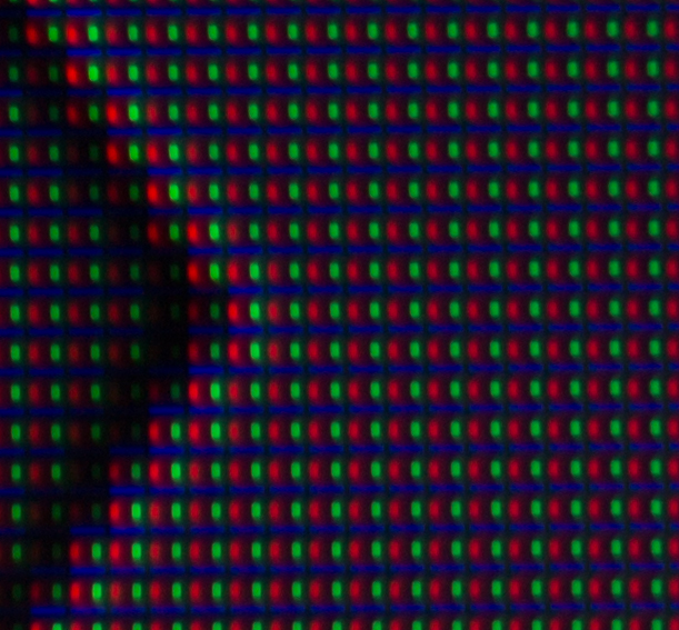
Enlarge / A close-up of the display.
Before we get into the list of deal-breakers, though, let's talk about the actual device. The face of the Gear features a 1.63-inch, 320×320 AMOLED touchscreen. A macro shot reveals the screen to have an S-stripe subpixel layout, the same display tech used in the Note 2. The Gear's display is passable, but the 277PPI means this is not the super-dense pixel party to which we've grown accustomed. Samsung's software doesn't push the display very hard, though, so it's not a big deal.
The exterior of the case is pretty sparse, with only a power button and a few pinhole mics on either side. In this tiny space, Samsung manages to pack a 800MHz Exynos 4212 processor, 512MB of memory, 4GB of storage, and a whopping 315 mAh battery. CPU-Z recognizes the Exynos as a dual-core chip, but the second core seems to be permanently disabled.
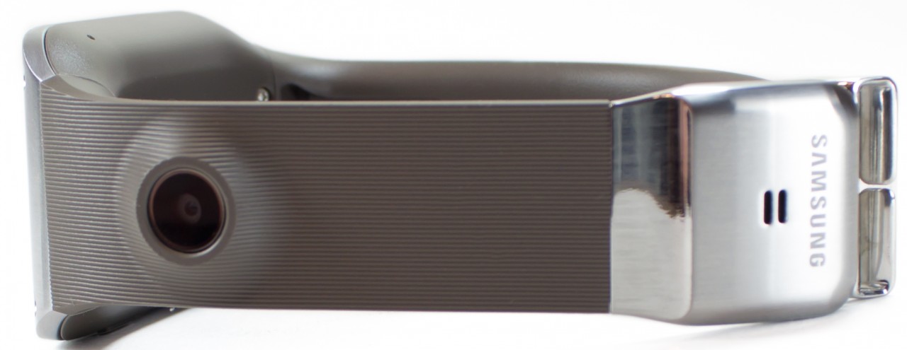
Enlarge / One side of the band, which houses a 1.9MP camera and a speaker in the clasp.
The most unique aspect of the Galaxy Gear is that there are electronics built into the entire watch. Unlike the Pebble (or a sixth-gen iPod Nano equipped with a watchband), which has a "dumb" band and contains all the electronics in the body of the watch, the Gear integrates a 1.9MP camera into the watchband and a speaker into the clasp. The side effect of this is that the band is a permanent part of the watch—you won't be seeing swappable bands any time soon.
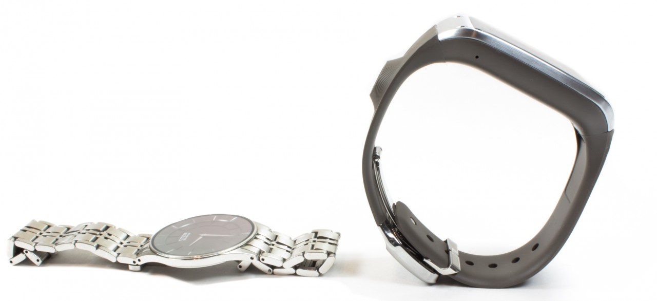
Enlarge / The stiff, supportive band of the Galaxy Gear stops it from resting on a wrist like a normal watch.
At about 11 mm (0.43") in depth, the case of the Gear is the normal thickness of a wrist watch. There's nothing about the depth that should make it look bad or geeky—men's jewelry watches are usually in the 5-14 mm range. Despite being in the size range of a normal watch, the Gear still looks unusual on the wrist thanks to the rubbery watchband. A normal chain link watchband is full of hinges, so it can never "support" the watch. With no support, the watch collapses onto the wrist, and any slack in the band will hang down by the clasp. The Gear's rubber band, however, is so stiff and supportive that any slack will cause the watch to "float" around your wrist and appear much thicker than it is. It's more like wearing a rigid bracelet than a real watch. The picture above tells the tale. On a table, a normal watch collapses into a heap, but the Gear is so stiff that it's self-supportive.
It seems that the primary reason for the rigid band is to give the camera a home and a sturdy connection to the rest of the phone. Considering the Gear requires a smartphone to be useful, the only reason for it to have a camera is convenience—you're guaranteed to have a much better one in your pocket. Without the camera, Samsung would only need to stash the speaker somewhere, and the band could be removable—or made out of something classier, like metal or leather. That would have helped its appearance dramatically.
One neat solution Samsung has come up with: the Gear has no on-board micro-USB port. Rather than make the watch thicker, the Gear's micro-USB port is offloaded to a separate "charging case." A plastic shell clips around the watch and connects to the internals via pogo pins on the bottom of the watch case. The shell has a door that surrounds the screen and locks into place for a secure connection. There is even an NFC chip in the charger to easily pair the Gear to your Samsung phone.
Samsung's designers adorned the front of the case with faux leather plastic and stitching. Unlike the Note 3, though, this isn't soft touch plastic, just hard, regular plastic, so it's more like faux faux-leather.
The software
The Galaxy Gear runs a heavily customized version of Android 4.2.2 (some parts are still referred to as "Touchwiz"). Navigation is fast and easy: Android's Back button is handled by swiping down from the top of the screen, tapping the power button works as Home, and there is the occasional on-screen menu button in the top right of the screen.
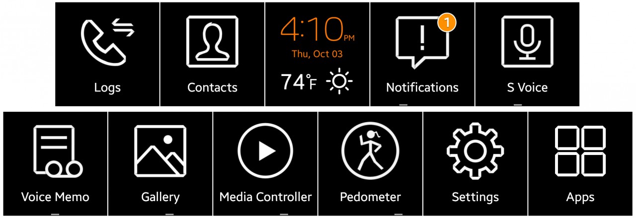
Enlarge / The main list of apps.
The software functions similarly to Google Glass. Everything is in a simple, horizontal UI. The "home screen" is a configurable watch face that can show the time, date, weather, and/or app shortcuts. Swiping left and right will take you through your primary apps, one at a time; tapping on an icon will open the app. Pretty simple stuff. The watch connects to your Samsung phone via Bluetooth and has a companion app that you can use to configure settings, install apps, and even make the Gear ring for easy locating if you lose it.
The Gear will turn on when you lift your arm up to check the time. Indeed, it can pretty reliably detect when you're looking at it thanks to the accelerometers. The detection feels pretty slow, though. You're staring at a blank screen for about a second before it kicks on. It's definitely not "glanceable," and the short delay is irritating.

The software itself is unattractive. It's a bleak mix of black, white, and orange coupled with primitive artwork. It reminds me of Android circa Gingerbread or Froyo, when the UI looked like something some programmer threw together in his spare time. The black background is probably to conserve power on the AMOLED display, but if you've ever used a 6th gen iPod nano, you know small devices don't have to be like this. So many screens are so completely devoid of color, you'd be forgiven for thinking the display was only capable of three colors.
The above middle screenshot is of one of the cooler features—the media controls. This app will act as a remote Bluetooth controller for whatever music app you currently have open on the paired device. It will display the track name while playing and allow you to adjust the phone's volume.

Enlarge / S-Voice on the Galaxy Gear.
There's no keyboard, so other than the touchscreen, your only other form of input comes via a stripped-down version of S-Voice. You can dictate text messages (but not e-mails), make phone calls, launch apps, add calendar events, and bring up the weather, all with your voice. There's no answer service, though (for instance "how old is Barack Obama?"), and despite the integrated speaker, S-Voice never speaks. It just quietly displays what you asked for.
S-Voice is extremely slow—you can really feel the 800MHz processor chug. It usually takes a few seconds to open and a few more to respond to a spoken command. Performance across the board is not very good. Indeed, the UI drops animation frames all over the place. After using the device, I felt like I was back in the stuttery Android dark ages.

Enlarge / Phone calls work great, and here is a rare instance of the Gear displaying actual colors. I am also obligated to mention "Dick Tracy."
Phone calls are the best piece of functionality on the Gear. The device is basically a wrist-mounted speaker phone. You can dial with S-Voice or with a microscopic dial pad. You can answer incoming calls, hang up, mute, or pass the call to your Bluetooth headset or smartphone. The quality on either end isn't spectacular, but it's a watch—what were you expecting?
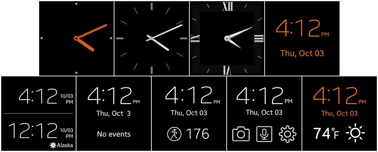
Enlarge / You can change watch faces.
There are a variety of watch faces to choose from. If you go the digital route, you can display the date, a second clock, a pedometer, app shortcuts, or the weather beneath the time.
Notifications
The primary function of a smartwatch should be to display incoming notifications and allow you to deal with them in a quick and effortless manner. That's the killer app that will get people wearing these things, so if you're going to release a smartwatch, your product had better be good at dealing with notifications.
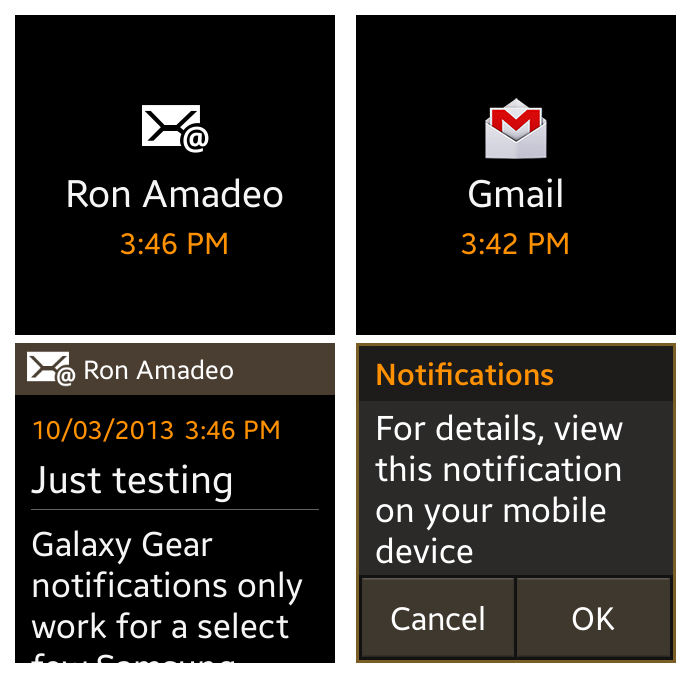
Enlarge / Left: The POP/Exchange e-mail app showing a message. Right: The worthless Gmail notification.
| SPECS AT A GLANCE: SAMSUNG GALAXY GEAR | |
|---|---|
| SCREEN | 1.63" 320×320 S-Stripe AMOLED display (277 PPI) |
| OS | Android 4.2.2 "Jelly Bean" |
| CPU | 800Mhz Exynos 4212 processor |
| RAM | 512MB |
| GPU | Mali-400 MP |
| STORAGE | 4GB |
| NETWORKING | Bluetooth 4.0 |
| CAMERA | 1.9MP camera |
| CASE SIZE | 36.8 x 56.6 x 11.1 mm |
| WEIGHT | 73.8 g |
| BATTERY | 315 mAh |
| STARTING PRICE | $299 |
| OTHER PERKS | It's a watch. |
Above are two notifications. The one on the left is from the POP/Exchange e-mail app. When a notification arrives, the watch displays an e-mail icon, and tapping on it will bring up the message text—that's perfect. On the right is a Gmail notification. An icon pops up, and tapping on it brings up... an error message directing you to turn on your phone and read the message there. How can you sell a smartwatch to Android users that doesn't work with Android's most popular e-mail service?
One of the features making Android devices so popular is their easy access to Google services. Heck, even iOS device users frequently leave the default apps alone in favor of Google apps. Some of Google's mobile apps are arguably the most popular apps on both platforms.
Google services do not work on this watch.
In fact, most popular apps do not work on the Galaxy Gear. Facebook, Twitter, Google+, and Hangouts all display the "view this notification on your mobile device" message instead of useful information. Effectively dealing with notifications is the number one thing a smartwatch needs to accomplish, and Samsung fell short of the mark. The only notifications that work and display actual information are the stock e-mail app, text messages, and phone calls—everything else displays that broken message.
At the bottom of every notification (even the broken ones) is a button that will display the message in question on your Samsung phone. It's a great feature and extremely handy to have. You'll need it a lot, because once you get a notification, the watch isn't very functional. Other than viewing the notification on your smartphone, there are usually no actions you can perform. You can reply by voice to a text message, but not to e-mails.
Camera
The Gear does have a camera, but a 1.9MP camera doesn't seem too compelling in this day and age. The old adage is "the best camera is the one you have with you," but considering the Gear requires a smartphone to function, you will always have a better camera with you. It doesn't seem to have much real purpose other than as a marketing bullet-point, or maybe for taking creep shots. With that said, Samsung put one in there, so we tried it out.

Enlarge / This one is surprisingly good.

Enlarge / Bad dynamic range is bad.

Enlarge / Forget about low light.
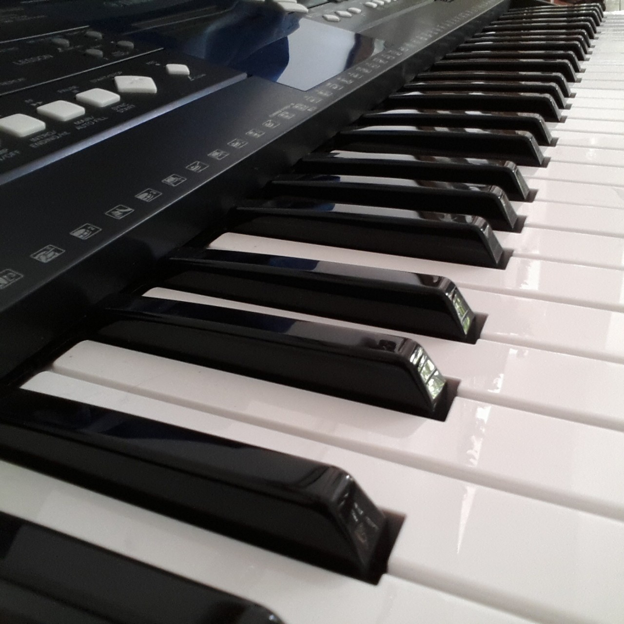
Enlarge / Indoor light makes for grainy pictures.
A tiny ecosystem
The biggest problem with the Gear right now is phone compatibility. The requirements are onerous: brand-new Samsung phones only, meaning that the Gear currently supports the Galaxy Note 3 and 2014 Note 10.1—that's it. Support will eventually be coming for the S3, S4, and Note 2 after they are updated to Android 4.3, but what about the rest of the Android universe? What about iPhone owners? The Gear needs a companion phone for data, so if it doesn't support your phone, it's useless to you.
A smartwatch will not be successful without a vibrant ecosystem of hardware and app developers. In order to have any hope of getting app developers on board, Samsung needed to cast as wide of a net as possible. More users means more developer support, and smartwatches desperately need more apps. Limiting a platform is only going to hamstring the development of an ecosystem.
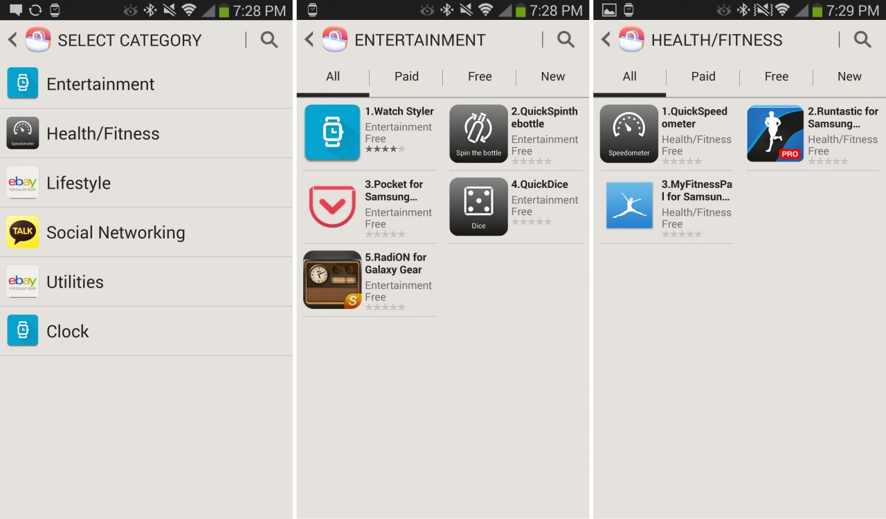
Enlarge / The first few sections of the Samsung app store.
The companion app has a "Samsung apps" section for the smartwatch. It's an extremely new ecosystem, so right now you're lucky to come across a screen with a scroll bar. There are 11 watch faces and 30 apps in Samsung's app store right now. A brand new category of device having a small number of apps at launch is fine, but Samsung is hamstringing itself with the limited phone compatibility. If the company sticks to only supporting year-old Samsung phones, the App Store faces an uphill battle.
What good is a smartwatch that doesn’t work with anything?
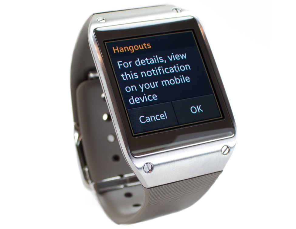
Enlarge / 90% of the notications on the Gear do this.
The Galaxy Gear doesn't do much that most people would want a smartwatch to do—it's just that simple. You'll want it to work with your existing phone; it probably won't. You'll want it to be a notification management machine; it's not. Think about it: when was the last time you saw a connected device that didn't support Twitter and Facebook out of the box? Samsung's sales pitch is currently "Hey, you there on the Google mobile platform, buy this watch that doesn't work with any of your stuff."
Do not buy this device expecting apps to show up and save the day. Taking a serious stab at ecosystem building is one thing, but the limited device compatibility means the only "developer" that will initially be supporting this watch is Samsung itself. Judging by what software is available at launch, Samsung may find that being a one-company ecosystem is extremely difficult. Samsung's thinking seems to be that if you make it to market first, you'll magically grow an ecosystem. But by not having a robust ecosystem in place, Samsung isn't giving consumers a compelling reason to buy its product in the first place. In my time testing the Gear and trying to integrate it into my life, I was left with the impression that I was wearing little more than a $300 wrist vibrator.
The Good
- First!
- A cool charging solution that offloads large components like a micro-USB port to a case—just don't lose it
- It's easy to open and pass notifications to your phone
- The back navigation gesture works great and doesn't require an extra button
- Phone calls work well, and you can accomplish everything phone-related directly from the watch
The Bad
- It makes no single part of your smartphone usage easier
- It currently works only with other new Samsung devices
- It can only handle notifications for texts, POP/Exchange e-mails, and phone calls
- No real support for Gmail, Facebook, Twitter, G+, or Google Hangouts
- The rigid band makes the watch look much thicker than it is, and it rests on your wrist more like a hard bracelet than a watch
- Ugly, design-challenged software that only uses three colors at a time
The Ugly
- The prospect of the Gear having a viable app ecosystem if Samsung insists on only supporting brand-new Samsung devices
TERIMA KASIH ATAS KUNJUNGAN SAUDARA
Judul: Samsung Galaxy Gear in-out review
Ditulis oleh Unknown
Rating Blog 5 dari 5
Semoga artikel ini bermanfaat bagi saudara. Jika ingin mengutip, baik itu sebagian atau keseluruhan dari isi artikel ini harap menyertakan link dofollow ke https://android-round.blogspot.com/2013/10/samsung-galaxy-gear-in-out-review.html. Terima kasih sudah singgah membaca artikel ini.Ditulis oleh Unknown
Rating Blog 5 dari 5


0 komentar:
Posting Komentar